The Problem
FRI is a research organization that gives engineers at large chemical and petroleum companies access to decades of technical research. Their online portal was how members accessed all of it. Three things were broken at once:
- Search was unreliable, engineers couldn't surface what they needed
- The admin team was manually doing work the platform should have handled
- The database the whole thing ran on was being shut down
What I Did
Rebuilt both the public site and member portal. Research, new IA, design system, and 60+ page designs, delivered in 13 months, 2 months before the database shutdown deadline. Stepped into the project management role at month 4 when the PM and lead developer both left.
Results
60+
pages designed and built for public site and member portal
Who Is FRI?
FRI is a non-profit research organization founded in the 1950s. Over 70 of the world's largest chemical and petroleum companies fund their work, and in exchange they get access to research they could never afford to run independently.
What FRI actually does: they run large-scale industrial experiments inside specialized distillation towers to study how crude oil and chemical mixtures get separated into usable products, fuel, industrial materials, and more. The results help engineers design and operate safer, more efficient systems. The kind of research that shapes real engineering decisions.
When engineers need trusted answers, they come to FRI. The website hadn't kept up with that.
The legacy public site and member portal. Three navigation menus, dense unstructured content, and an admin experience that made routine updates painful.
The Challenge
FRI came with a clear list of needs and one hard deadline underneath all of them. Their database provider was shutting down at the end of the following year. Every research paper, handbook, video, and case study that members depended on needed to be migrated to a new system before that happened. No flexibility there.
On top of that, both the website and member portal had fallen behind. Three navigation menus with no clear logic. A research archive that was hard to search. The content existed, getting to the right document was the problem. An admin CMS so slow and inconsistent that routine updates had become genuinely painful. And a public site that couldn't make the case for FRI to anyone who hadn't already joined.

FRI's member engineers, chemical and petroleum professionals worldwide whose daily work depends on reliable access to FRI's research archive.
The Audiences
Three groups needed this platform to work.
Member engineers: chemical and petroleum professionals worldwide. They search rather than browse, arrive with a specific task, and expect to complete it without friction. When the platform is slow or content is buried, it makes the membership feel worthless.
Non-members: engineers or company decision-makers evaluating FRI for the first time. The public site was their only view into the organization.
FRI's admin team: the small internal team responsible for uploading research, running events, updating member information, and maintaining content across 60+ pages. They needed tools that actually made their job easier.
Research and Discovery
The research phase is what changed the scope of this project.
Stakeholder Interviews
The primary contacts at FRI were the admin team, the people who managed the platform day to day and knew its limitations better than anyone. Those early conversations covered what members requested most often, where the CMS broke down, what content was hardest to manage, and how much runway the database shutdown left.
FRI's internal IT manager gave the team access to the existing database, walked through how content was organized, and helped the team understand the technical landscape before any design work began. That context shaped how the research repository was eventually structured.
Member Interviews
Engineers were consistent in what they described. They come to the portal with a specific task: find a report, download a handbook, prepare for a meeting, and they want to complete it quickly. They don't browse. They expect search to work. When it doesn't, it slows down real work.
"I come here to find a specific report, not to browse. If I can't find it in two minutes I go somewhere else."
Member engineer, portal interview
"Search doesn't work the way I expect. I know the content is in there but I can't surface it reliably."
Member engineer, portal interview
"Uploading a new research document takes three times longer than it should. We've just accepted it as part of the job."
Admin team, CMS workflow interview
"We manually notify members when new research is published because the system has no way to do it automatically."
Admin team, workflow interview
The finding that changed the project: the admin team was tagging content, cross-referencing documents, and manually notifying members of new research by hand. Not by choice. The system had no way to do it. That had just become normal. The CMS couldn't just be cleaner. It had to be built differently.

A persona built from member interviews, capturing how engineers use research day to day, what slows them down, and what they expect from a platform they rely on professionally.
Portal over public site
Members came to FRI for the research. If they couldn't access it reliably, nothing else on the platform mattered.
Search is the core task
Members don't browse. They search. For a platform holding decades of research, not being able to filter and surface documents quickly was a fundamental gap.
Admin burden was invisible
The platform had been quietly offloading work onto the admin team for years. Nobody had named it because it had become normal.
Public site had one job
Non-members needed to understand what FRI does and whether membership made sense. The existing site couldn't answer either question clearly.
Define
With the research organized, personas were built for each audience: member engineer, non-member evaluating FRI, and admin user. The new site structure was organized around two distinct journeys rather than how FRI organized itself internally.
Public: Learn. Validate. Join. A clear path for someone unfamiliar with FRI to understand the organization and decide whether membership makes sense.
Portal: Access. Search. Act. Fast access to research, meetings, training, and account tools. Centralized search. No unnecessary steps between a member and the content they need.

A clear process framework mattered on this project. With a hard deadline and a large scope, jumping to solutions early would have cost us later.
Staying on Track
The public site launched first. While design work was underway there, the full-stack developer used that time to map the existing portal database and understand what a migration would require before anyone committed to an approach. It bought the time needed to do that properly.
At month four, both the project manager and the full-stack developer left the agency at the same time. No handoff. A six-person offshore development team in Poland was brought in as the replacement, and I took on the project management role alongside design work. That meant writing requirements, running sprint planning, maintaining the roadmap, and coordinating across a seven-hour time difference, while still being the person responsible for every design decision on the project.
The ramp-up was slow. Getting six developers oriented on a project mid-stream takes real time. We came in at 13 months instead of 12, still two months ahead of the hard deadline. Better documentation early on would have helped. That's on me.

Early wireframe sketches for the portal and key public pages. Structure and navigation logic first. Visual detail came later. Getting the IA right at this stage meant the offshore development team had a clear reference from day one.
Design Priorities
Member portal over public site. The portal was where membership value was experienced. Every decision that forced a tradeoff defaulted to making the portal better.
Search as a first-class feature. Not an afterthought. Filters by document type, topic, date, and relevance across all content types. The structure of content and metadata had to support this from the start.
CMS built for humans, not workarounds. The admin team's ability to manage content efficiently wasn't a nice-to-have. It was a core design requirement that shaped every content model and publishing workflow.
Develop
Before touching individual pages, a new design system was built: color palette, typography, iconography, layout grid, and a component library. The result scaled consistently across 60+ pages and gave the offshore development team a clear reference throughout the build.

A moodboard presented to FRI stakeholders before design began. Getting sign-off on color, typography, imagery, and tone here meant the design direction was agreed on before a single page was built.

A sample of the FRI design system, covering components, forms, and patterns used consistently across 60+ pages and referenced by the offshore development team throughout the build.

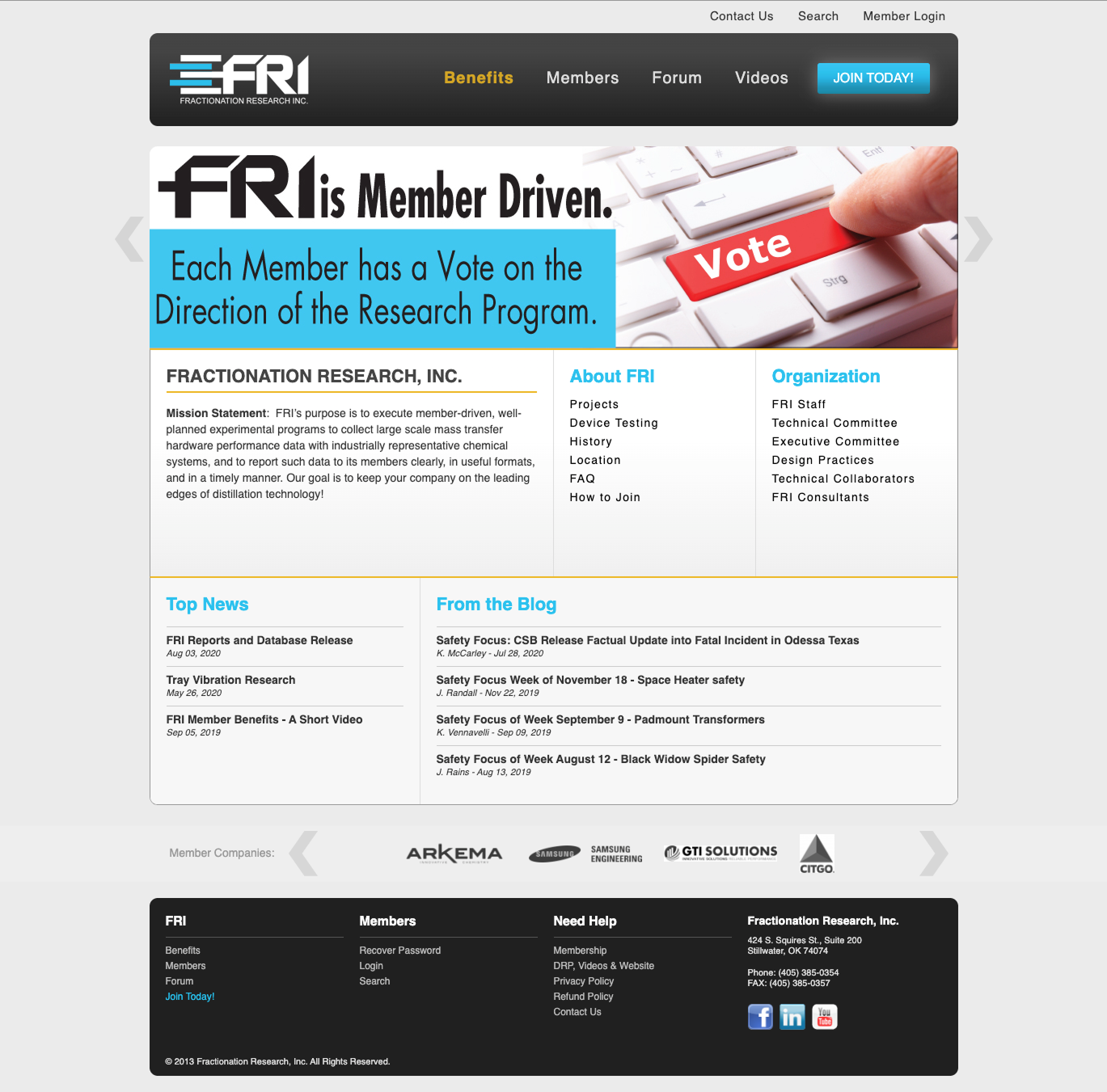
The redesigned FRI homepage.
Public Site: Homepage
Three navigation menus became one. The homepage answered the basic questions clearly and gave visitors a direct path to learn more or get in touch. Plain language, no assumed knowledge of FRI's history or structure.

About Page
The About page rebuilt to communicate FRI's mission and credibility without assuming prior knowledge. A non-member evaluating FRI for the first time needed to understand what the organization does and why it matters, in plain terms, not industry jargon.

Member Companies
A dedicated page for member companies, one of the most important proof points for a non-member evaluating FRI. Seeing that 70+ of the world's largest chemical and petroleum companies are members makes the case faster than any description could.

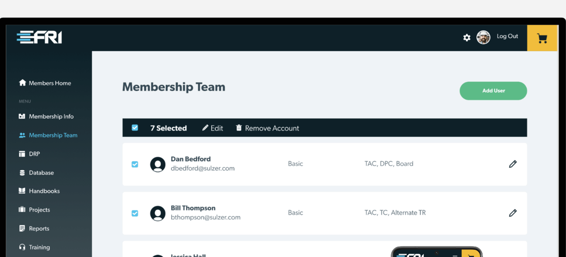
Member Portal: Dashboard
The portal was the most important part of the project. The redesign was built around one goal: get engineers to the content they need as fast as possible. A dashboard that surfaces recent and most-accessed research on login. Centralized navigation across research, meetings, training, and account tools.

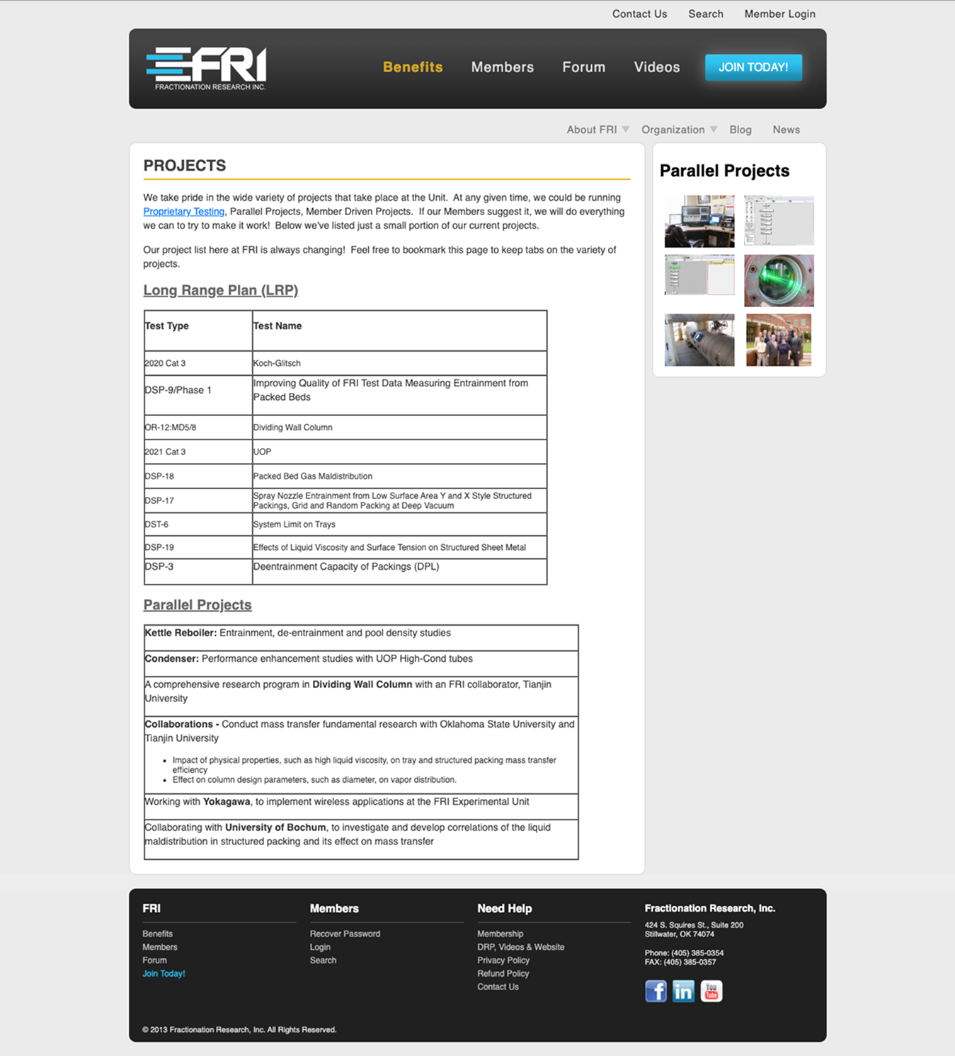
Research Repository
The repository held decades of research across multiple content types. Filters by document type, topic, date, and relevance. Consistent card layouts so members always know what they're looking at and what to do next. The structural decisions here mattered more than any visual choice on the project.

Centralized Search
Centralized search across all content types was a core requirement from day one. Engineers come with specific tasks and expect search to work. Filters organized around how engineers actually think about their work, by topic, type, and relevance, not how FRI internally categorized its content.
Impact
Both sites launched before the database was discontinued. That was the outcome everything was built around.
FRI's research archive, spanning decades of reports, handbooks, training materials, and technical resources, was successfully migrated into the new system before the shutdown date. Members retained uninterrupted access to the research they depend on. That was the only outcome that mattered.
The rebuild also gave the admin team a CMS structured around how they actually manage content. Uploading research, publishing meeting materials, and updating pages no longer required the workarounds that had become routine in the old system.
For an organization whose entire value is reliable access to trusted research, the outcome that mattered was uninterrupted access through a major platform migration. That's what happened.
What We Took Away
The admin interviews were the most important research on this project. We almost skipped them. The initial brief framed this as a member experience problem, and that assumption shaped the early research plan. Admin workflows were on the list but low priority.
What came out of those conversations changed the scope of the project. The team was doing by hand, routinely, what any reasonable platform would have automated. Tagging content. Cross-referencing documents. Manually notifying members when new research published. Not because they wanted to, but because the system had no way to do it. It had become so normal nobody had named it as a problem. They'd just built their jobs around it.
If we hadn't done those interviews, or had done them too late, the redesign would have given members a better search experience and left the admin team exactly where they were. Surfacing that early enough to address it changed what the CMS had to be.
Losing half the team at month four was the hardest moment in the project. It wasn't in any plan. You figure it out or the project fails. I stepped into the PM role, kept the design work moving, and got a new team up to speed on a complex project mid-stream. The project shipped two months early. I'm proud of that. But I also know the extra month it cost us came from documentation gaps that were my responsibility to catch earlier.
The documentation thing is the lesson I keep coming back to. Decisions made quickly between a small group rarely get written down. When the team changed at month four, rebuilding that context with a new development team mid-project cost real time. More deliberate documentation from the start would have helped. I'd do that differently.

%20(6).png)
%20(4).png)
%20(5).png)


