The Problem
Embark is a financial consulting firm competing for large enterprise clients. Their work was strong and their clients were loyal, but the website couldn't communicate any of it. The site had grown through years of quick fixes with no coherent structure, and senior decision-makers were leaving before anyone at Embark got a chance to talk to them.
- No consistent voice or visual structure. Every page felt like it was built by a different team
- Content was bare and vague. Visitors couldn't tell what Embark did or why it mattered
- The site couldn't support the inbound content program running alongside it
What I Did
Full site redesign in 4 months. New information architecture, navigation, content strategy, messaging, and visual design system, built around how a potential client actually evaluates a consulting firm, not how Embark thought about itself internally.
Designed a scalable IA and page template system in HubSpot so Embark could produce content continuously. The goal was to turn the site into a lead generation tool, not just a rebrand.
Results
$17M→$24M
revenue in the year following launch
3
new offices opened following launch
Who Is Embark?
Embark helps CFOs navigate the hard stuff: audits, M&A, complex financial reporting. Their team came largely from the largest global accounting firms, and they operate with a belief most consultancies have abandoned: happy consultants make happy clients.
Client satisfaction scores ran over 70% above industry average. The work was genuinely good. The relationships were strong. The website told none of it.
I came to this project through the inbound marketing agency Embark worked with. Embark treated the agency as an extension of their own team. We wrote their content, designed their marketing materials, ran their social channels, and helped them generate leads. That relationship meant we understood their business and their audience before the redesign ever started. The work we were doing for them and the site we were building had to support each other.
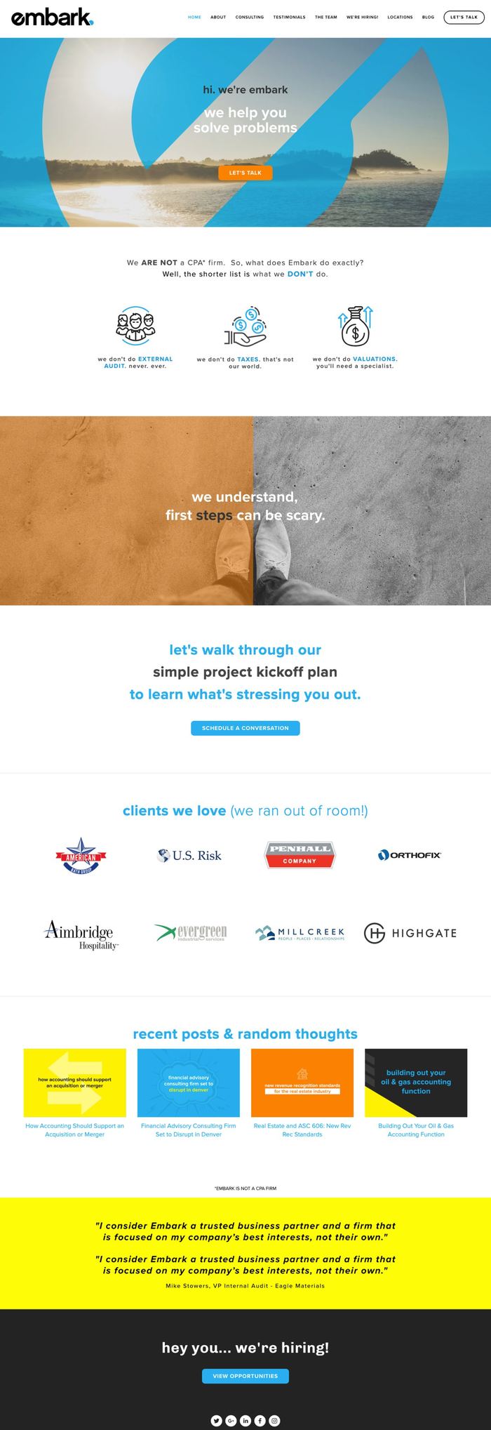
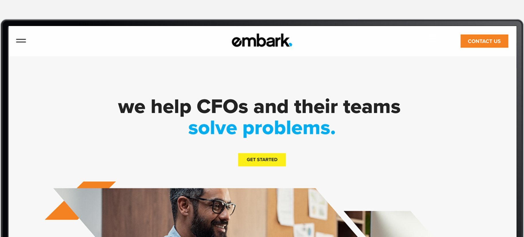
The existing site. Inconsistent navigation, dense unstructured content, and a homepage that still couldn't clearly explain what Embark did.
The Challenge
Embark was at an inflection point. Growing fast, competing directly against Big 4 firms for serious enterprise clients, and betting that culture and people would win business that bigger firms take for granted. That bet only works if a CFO can actually find the evidence for it.
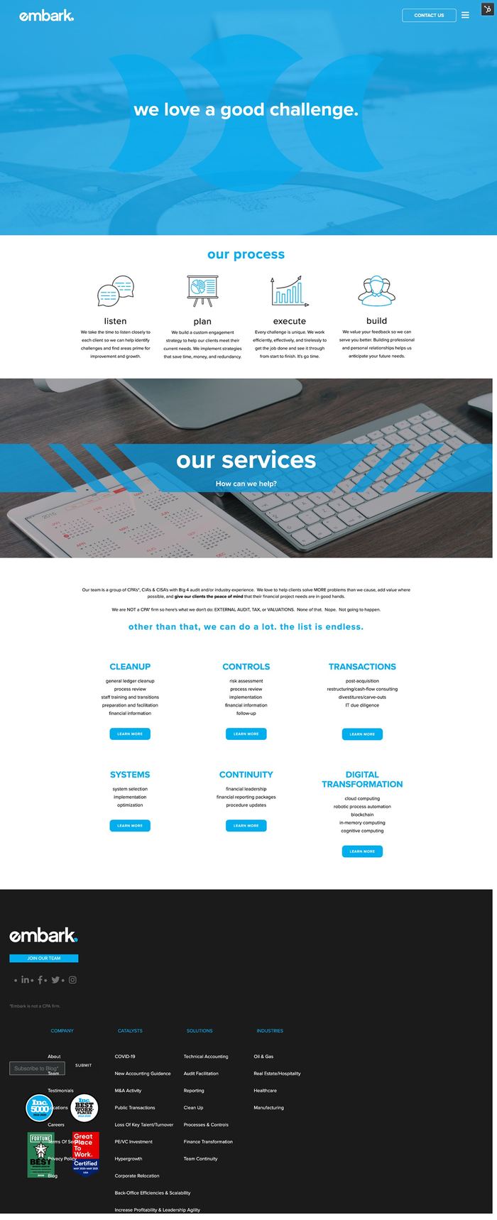
The site had grown through years of one-off pages and quick fixes, each one solving an immediate problem without thinking about the whole. Inconsistent navigation, redundant pages, a homepage that still couldn't clearly explain what Embark did. The About page hero read: "embark (verb): to make a start or to begin." A dictionary definition of the company name. For a CFO arriving with a specific financial problem, that told them nothing useful.
The real cost wasn't aesthetic. The site had no consistent voice. No structure a visitor could follow. Pages that looked and felt like they were built at different times by different people, because they were. The content that did exist was so vague that a CFO arriving with a specific problem couldn't tell whether Embark could solve it. CFOs make fast judgments. If the site couldn't establish credibility in the first ten seconds, Embark never got a chance to show what they were capable of.
The timeline was compressed from six months to four. Stakeholders wanted the redesign live before the new fiscal year.

The Embark team. Big 4 backgrounds, independent firm. The culture was the differentiator. The site just wasn't telling that story.
Research and Discovery
I started with internal stakeholders before talking to any users. What the team believes is broken and what users actually experience are often different things.
Stakeholder Interviews
The first conversations were internal, deliberately. The sales team described a pitch the site actively contradicted. Consultants talked about the kinds of questions buyers asked that the site had no good answer for. The CMO had a clear vision for where the brand needed to go that the current site couldn't support.
That gap, between what the team knew Embark was and what a visitor would actually see, became the clearest framing for what needed to change.
User Interviews and Surveys
Four one-on-one interviews were conducted with finance leaders and CFO proxies, alongside surveys to broaden the signal. The interviews focused on three questions: what makes someone seek outside consulting help, what makes a firm feel credible on first visit, and what sends them straight to a competitor.
"CFOs judge professionalism fast. They scan, they don't read. Vague marketing language doesn't get the benefit of the doubt."
Research finding, user interviews
"Slow performance does not just frustrate them. It reads as a sign of the firm's broader reliability."
Research finding, user interviews
"The team page was the first thing I wanted to see. If I can't find someone with the right background, I move on."
Research finding, user interviews
"Clicking back after a consultant profile reloaded the whole page and dropped you at the top. That's a reason to leave."
Usability testing, existing team page
Usability Testing on the Existing Site
Before sketching anything, usability testing was run on the current site. The findings were specific. People were genuinely confused about who Embark was. The messaging was vague and stock imagery made it worse. The team page problem showed up clearly, clicking a consultant profile opened a new page, clicking back reloaded entirely and dropped you at the top. For someone scanning a roster to find the right expertise, that friction wasn't a minor annoyance. It was a reason to leave.
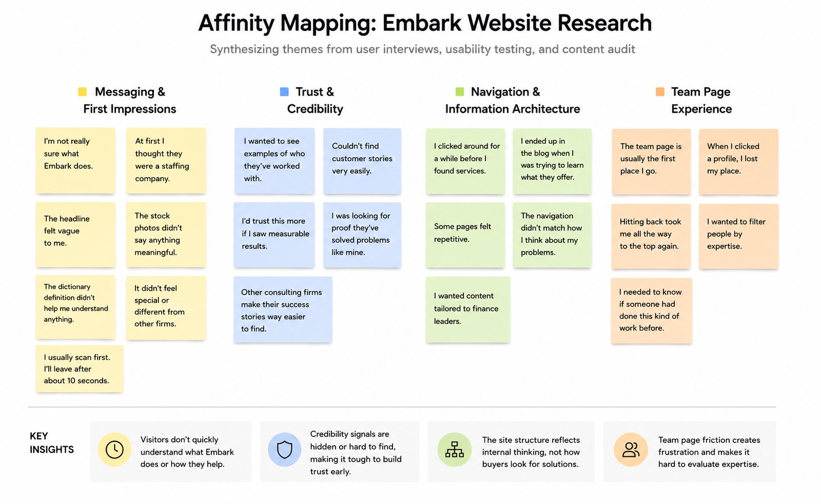
Affinity mapping across interviews, usability tests, and the content audit. Four clusters emerged: messaging and first impressions, trust and credibility, navigation and IA, and team page experience.
The case for full restructure: the research pointed clearly toward replacing the nav entirely, not patching it. What moved the stakeholders wasn't the recommendation. It was watching real users struggle through the existing structure in a usability session. That made the case in a way a slide deck never could.
Competitive Benchmarking
Reviewing Deloitte, PwC, EY, KPMG, and a handful of challenger consultancies made one thing clear: the largest firms lead with structure and proof, not personality. Every service page answers the same questions in the same order. Embark had the expertise and a genuinely distinctive culture. The site just wasn't built to show either one.
CFOs scan, not read
Clarity and proof need to land in the first ten seconds or the visit is over.
Performance is a trust signal
Slow load times don't just frustrate. They read as a proxy for the firm's reliability.
Big 4 sets the standard
Embark is being held to that bar without knowing it. Structure and proof matter as much as personality.
Team page is a decision point
CFOs go looking at the people once they've decided a firm can solve their problem. That page needs to work.
Define
Affinity mapping across interviews, usability tests, and the content audit pointed to one structural problem: the site was organized around how Embark thought about itself internally. The new structure was organized around how a potential client actually evaluates a firm.
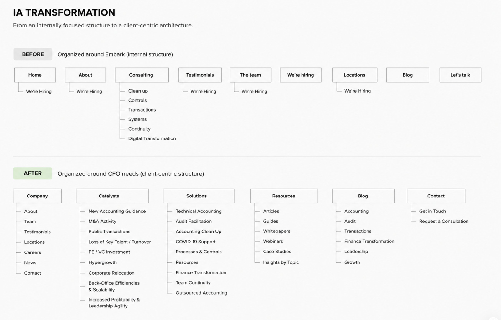
Before: organized around Embark's internal structure. After: organized around CFO needs, with dedicated tracks for catalysts, solutions, and resources built to scale alongside the content program.
Every page followed the same sequence: Problem. Solution. Proof. People. Contact. That sequence came directly from the interviews. CFOs told us they arrive with a specific problem, evaluate whether a firm can solve it, look for proof that they've done it before, then go straight to the people to decide whether they trust them. That order is how a skeptical buyer actually moves. Making it the structure of every page meant a CFO could land anywhere on the site and follow the same logic through.
Getting Aligned
About six weeks in, it was clear the project was trying to be too many things at once. The CMO had priorities. The sales team had different ones. The timeline had already compressed from six months to four. Everyone was aligned on the goal but not on what that meant in practice.
I put together a scope document that laid out everything in the backlog against the time and resources we actually had. Not to cut things arbitrarily, but to force an honest conversation about tradeoffs. What had to be right at launch to make the site work for a CFO. What could come in phase two without hurting that goal.
We cut the launch scope by nearly half. At the time that felt like a setback. Looking back it was the decision that made everything else possible. The team had a clear target, stakeholders had shared expectations, and the work that shipped was actually done well rather than half-finished across a wider surface.
Design Priorities
Restructure the IA around the buyer, not the org chart. The old structure reflected how Embark thought about itself. The new one reflected how a CFO evaluates a firm.
Fix messaging before designing pages. No amount of good design was going to fix inconsistent content. The writer, who had a financial background, worked alongside the CMO from the start, not at the end.
Surface proof where it does work. Testimonials, team depth, and client outcomes moved from buried pages to where a CFO would actually see them.

Early sketches exploring structure and hierarchy before moving into Adobe XD. The goal at this stage was testing direction, not detail.

Multiple layout directions were explored before committing to high fidelity. Keeping options open here saved time later.
Develop
With structure and messaging aligned, design moved quickly. Redundant pages were collapsed, services were renamed in the language CFOs use to describe their own problems, and every major page had a clear path to get in touch.
The restructure was about more than navigation. Embark was running an active inbound program. Blogs, guides, whitepapers, industry content. The old site had nowhere to put any of it coherently. The new IA was designed with that in mind. Every solution category, every catalyst, every industry vertical was a slot. Somewhere specific for content to live, and somewhere relevant for traffic to land. The architecture was built to grow with the program, not just clean up what already existed.

The redesigned team page with filtering by position and location.
Team Page
CFOs go looking at the people once they've decided a firm can solve their problem. Filtering by expertise and location was added so the right person could be found quickly.
In-page profile views eliminated the full page reload that had been quietly pushing people away. It became one of the highest-performing pages after launch.

In-Page Profile Views
The old experience sent visitors to a new page for each consultant, then reloaded from the top on back. The new experience keeps everything in context. A small change that removed significant friction.

Resources Page
The resources section was rebuilt with filtering by topic, keyword, and industry. CFOs could find signals of expertise fast rather than scrolling through an undifferentiated list.

Blog with Tag Filtering
The blog rebuilt with filtering by topic, keyword, and industry, giving visitors a fast way to find content relevant to their specific situation rather than a reverse-chronological scroll.

Service Pages
Service and industry pages were rebuilt around a consistent framework: problem, solution, proof, contact, so a CFO evaluating Embark for a specific situation had somewhere relevant to land.

Industry Pages
Industry-specific pages gave CFOs a path that felt relevant to their world, not a generic services overview. A visitor in healthcare could land somewhere that spoke directly to their situation.
Impact
The site launched in January 2019. Embark grew from $17M to a projected $24M in revenue in the year following launch. They expanded into three new offices. The team page became one of the highest-performing pages on the site, which makes sense given how consistently the research pointed to it as where CFOs go to decide whether the people behind the pitch are worth trusting.
Embark was already a strong business. But the old site was a brochure that couldn't explain what they did. The new one was a lead generation tool. Content had somewhere useful to go. Traffic had somewhere relevant to land. The timing of the growth lines up with a company whose website finally started doing its job.
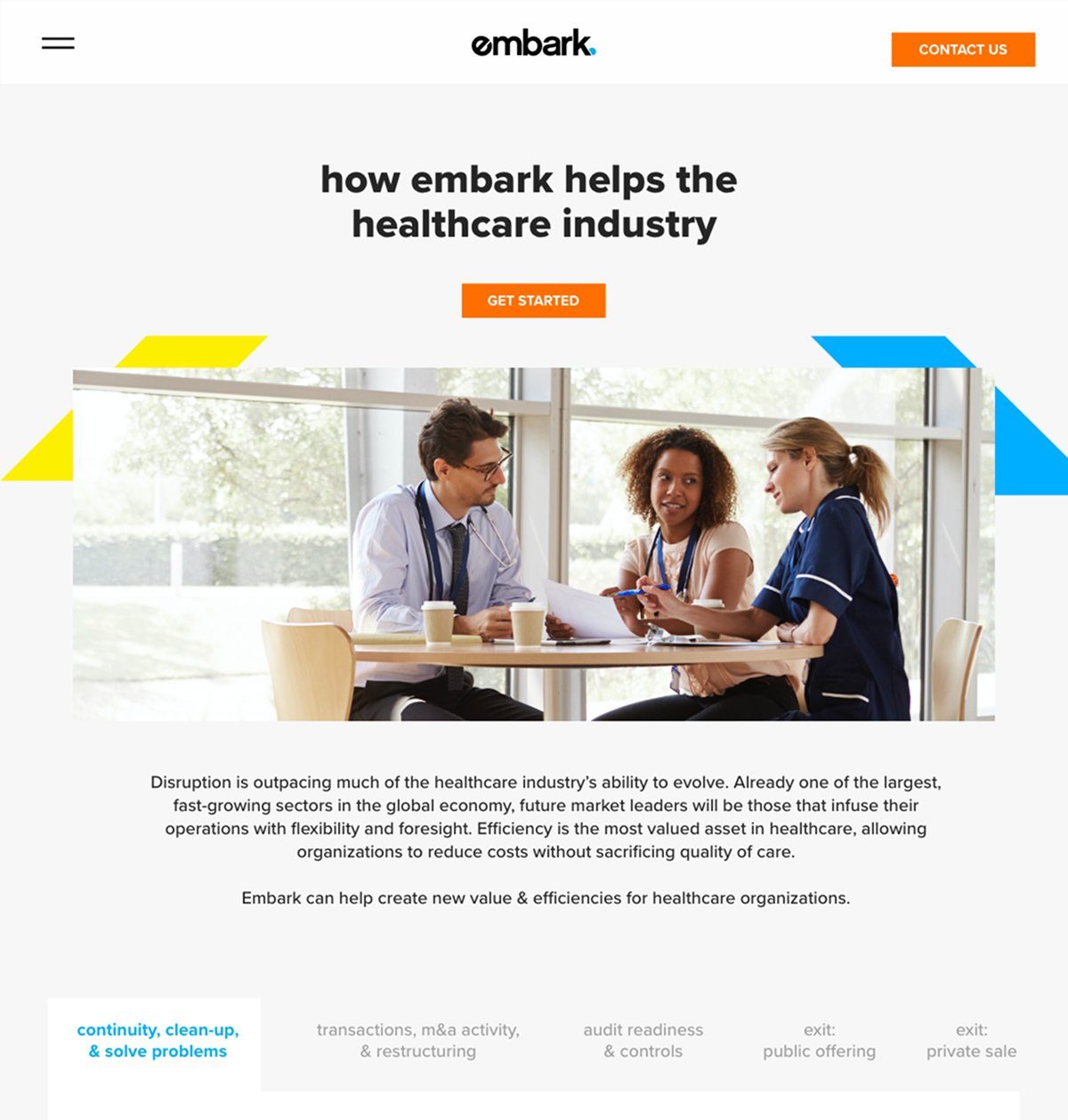
One of the templated industry pages built on the new IA, designed to be reused as Embark's content program expanded into new sectors.
What We Took Away
The discovery phase felt slow. Four months is tight and spending the first weeks in interviews instead of Figma felt like a risk. But the research kept surfacing things we would have gotten wrong otherwise. The team page wasn't on the original priority list. Performance as a design concern, not just a technical one, came from a user interview. The messaging direction came from understanding how the sales team actually pitched the firm, which was completely different from how the site described it. None of that comes from jumping straight to wireframes.
The scope conversation was uncomfortable. But it was the right thing to do early rather than discover the problem at month three. When everyone understands the tradeoffs going in, the decisions made along the way have context. Without that conversation, the project would have ended with disappointed stakeholders and a half-finished site.

%20(6).png)
%20(4).png)
%20(8).png)


