I decided to follow BDC's UX Double Diamond Design Thinking process to ensure that my design decisions were supported by user research and feedback.

phase 1: discover
Voice of customer Surveys - current site
We reviewed 2.5 months of voice of customer data surveys.
Key Findings:
- Customers needed a better understanding of the product offerings, options, and specs. Many questioned why specific options weren't available or were curious to know more about product materials.
- Customers also wanted to see pricing options much earlier in the customer journey.
phase 2: define
OUr personas
FedEx Office has five unique personas. These personas below focus on their possible motivations, frustrations, and goals.

summary
Through these personas, we can understand why these audiences value making the right decision as quickly as possible. In building the current experience, we aimed to do just that. Previous research told us that the quicker we led customers to the product details page the more likely they were to convert. For simple print jobs like copies or manuals this held true, however, for complex products like yard signs or business cards, customers needed a little more guidance in making the right decision.
For simple print jobs like copies or manuals this held true, however, for complex products like yard signs or business cards, customers needed a little more guidance in making the right decision.
competitive analysis
As we were defining our solution, we looked at how other retailers were structuring the customer journey. Many of these retailers, were leading customers to an intermittent landing page – giving customers a high-level overview of the various options before directing them to a product page.

phase 3: develop
Ideating the Solution
One of the elements on this landing page was this shop by type section. This content box would allow users to quickly compare print options. In addition to the shop by type section, this page also details product pricing, design template inspiration, and faqs.


phase 4: deliver
Prototyping and Validation
I created a Hi-Fi clickable prototype of a product category landing page. We tested this prototype against the current experience, with 10 participants. When selecting a product from the navigation, in this case, "yard signs" which path did users expect and prefer and why?
8/10 participants preferred going to the category landing page first, saying it gave them more options to choose from and was visually easier to make an informed decision.
Product Category Page:

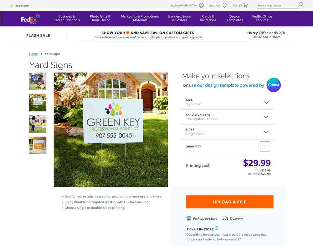
Product Details Page:

But what if users were taken directly to the product details page, either through organic search or other means? Could we also improve the experience on this page so that customers are aware of those different options?
We tested two unique layouts below that presented additional product information to the customer. The first is more of a visual menu with the second option being more like the existing experience with the addition of a tooltip guide.
Visual Menu:
Tool Tip:

7/10 participants preferred the visual menu drop downs due to streamlined appearance and fewer steps to access information


