The Problem
FedEx Office sells custom print products online. On complex product pages like yard signs,customers couldn't tell what they were looking at,pricing showed up too late,and drop-off was high. Customer survey data had been flagging it for months.
What I Did
Designed and usability-tested two solutions:a new category landing page that gave customers context before asking them to choose,and two product detail page variants to see which removed the most friction at material selection.
The goal was to come out with something testable,defensible,and ready to build.
Results
8/10
preferred the landing page over going straight to a product page
7/10
preferred seeing material options as images over reading text labels
2
concepts approved for full rollout
Who Is FedEx Office?
FedEx Office is the retail division of FedEx. They operate stores across the country offering printing,custom signage,shipping,and business services to everyday consumers and small business owners. A big part of their business is custom print products,items where customers have to make decisions about size,material,finish,and design before placing an order.
In late 2021 FedEx Office launched a new e-commerce marketplace. Four months in,it was already showing signs of a problem.
The Challenge
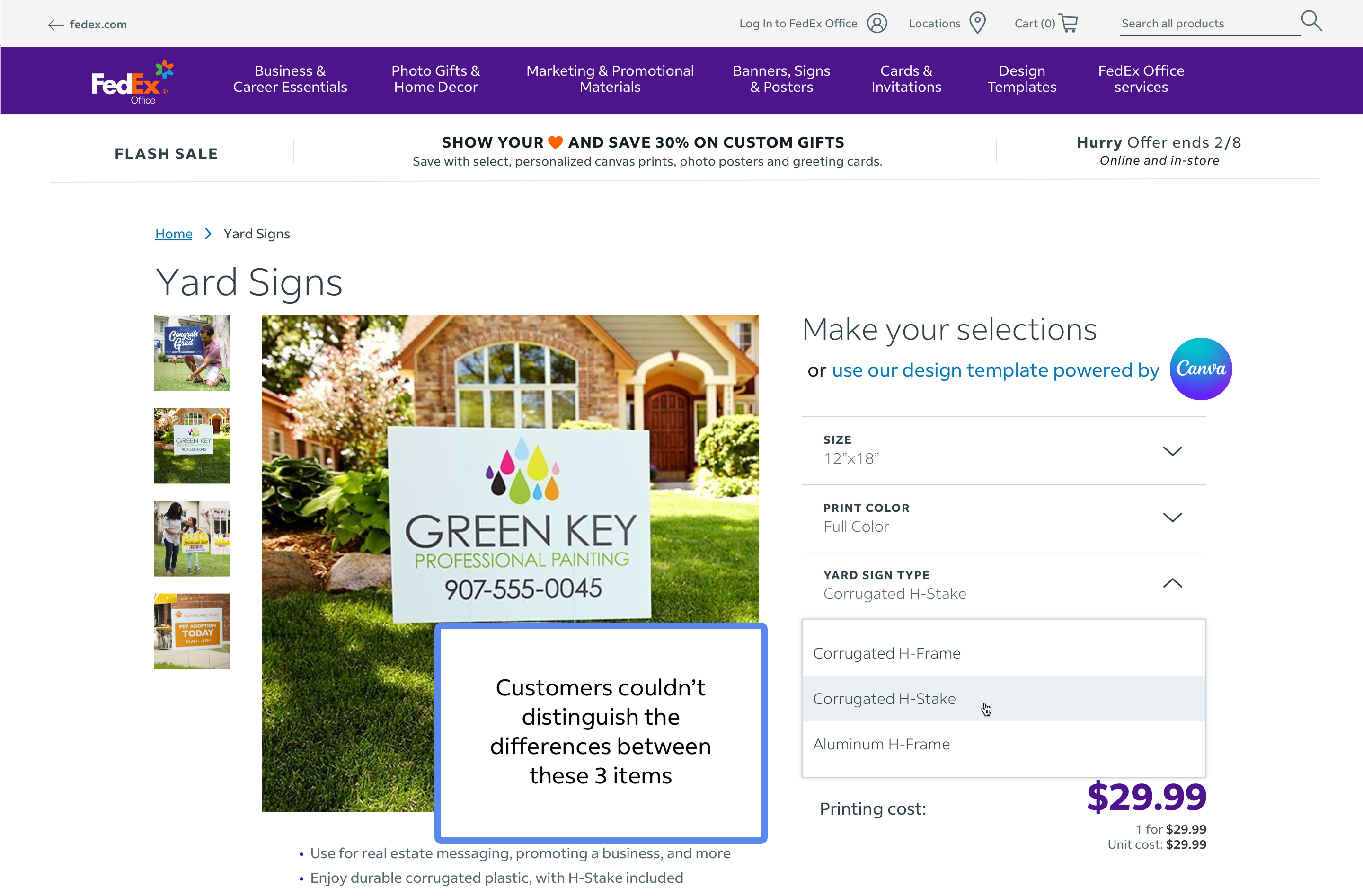
2.5 months of voice of customer data told a consistent story. Customers couldn't tell the difference between material options. They wanted to see pricing before they'd committed to a path. And on pages like yard signs,four options with no explanation of what set them apart,were leaving without buying.
The marketplace was four months old. This was the right moment to fix it before the confusion became the norm.
The Audiences
FedEx Office had five existing company personas. Two were most relevant to this project:the full-time employee/volunteer and the small business owner,both of whom needed precise products and had little tolerance for ambiguity.
Full-time employees and volunteers ordering for work events,school projects,or community activities. They often don't know printing terminology and need the site to guide them quickly. If it can't,they leave.
Small business owners ordering branded materials to represent their business. They move faster and know what they want,but are equally unforgiving of unclear product information. A wrong order at scale is expensive.
Both personas needed precise product guidance before committing,enough context to make the right choice with confidence.
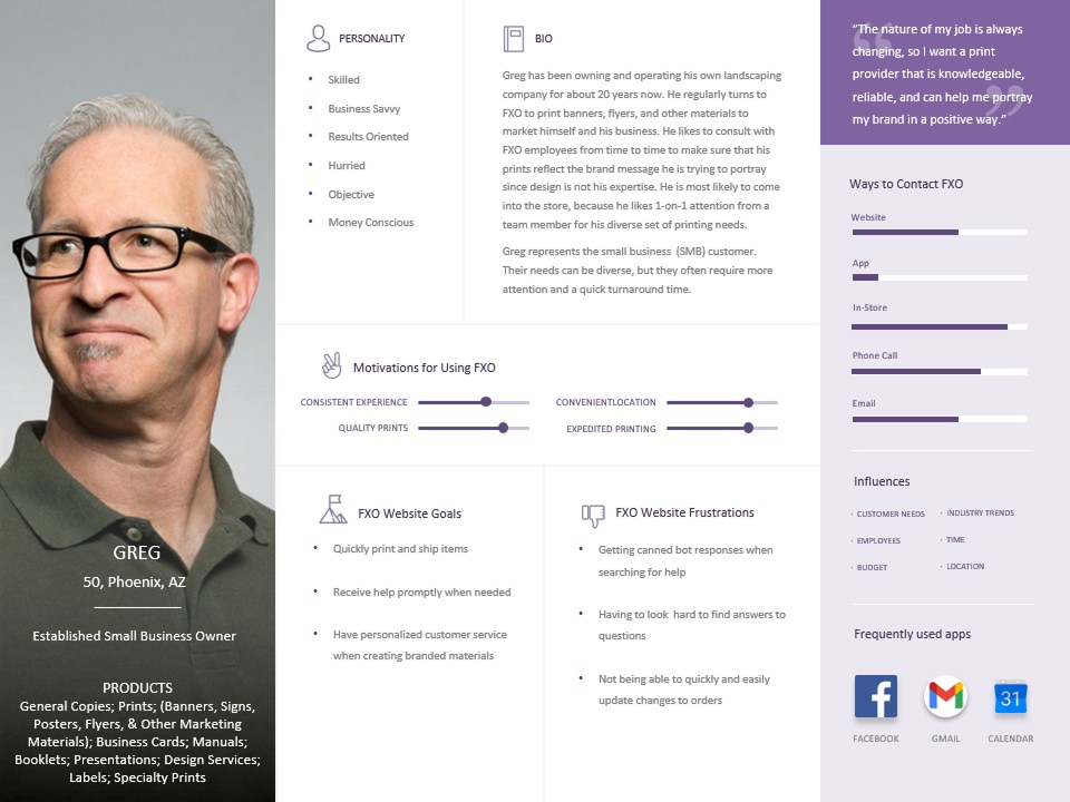
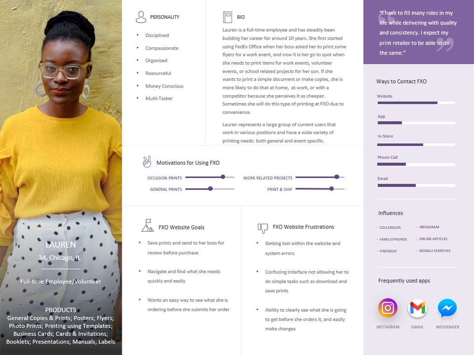
Two of five existing FedEx Office personas selected for this project. Lauren,a full-time employee and volunteer,and Greg,an established small business owner,both needed precise product options and clear guidance before making a purchase decision.
Research and Discovery
98 customers had shared feedback on their marketplace experience. The patterns were consistent.
Voice of Customer Surveys
2.5 months of customer survey data from FedEx Office's own marketplace users. The patterns were consistent enough to act on quickly,confusion around materials,pricing visibility,and product differentiation showing up repeatedly across both audience types.
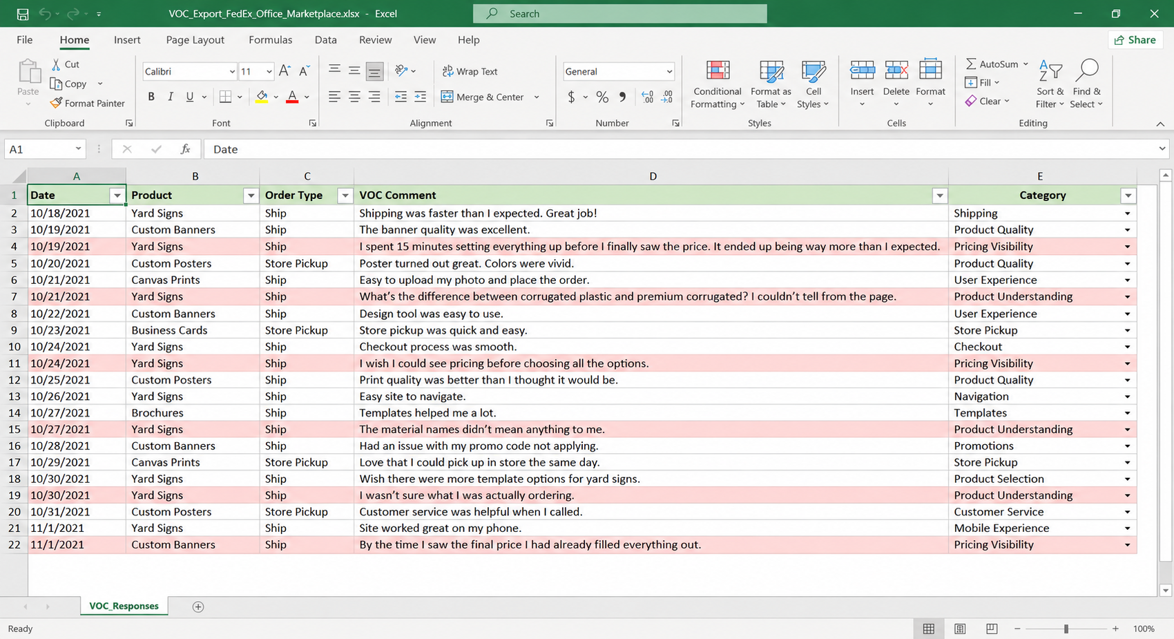
The patterns were consistent across 98 respondents. Customers needed better explanations of what each product option actually was. Materials were confusing without visual references or plain language. And pricing was showing up too late. By the time customers saw what something cost,they had already invested time they were not willing to repeat if the price was wrong.
"I couldn't figure out the difference between the corrugated options. I just picked the cheapest one and hoped for the best."
VOC respondent,yard signs
"I spent like 20 minutes configuring everything and then saw the price. Way out of budget. Had to start completely over on a different product."
VOC respondent,custom print
"What's the actual difference between H-frame and H-stake? The site doesn't explain it anywhere. I ended up just Googling it."
VOC respondent,yard signs
"Honestly the site is fine once you know what you want. If you don't already know what you need it's kind of confusing."
VOC respondent,general
The page was asking customers to choose before giving them what they needed to choose well.
Competitive Analysis
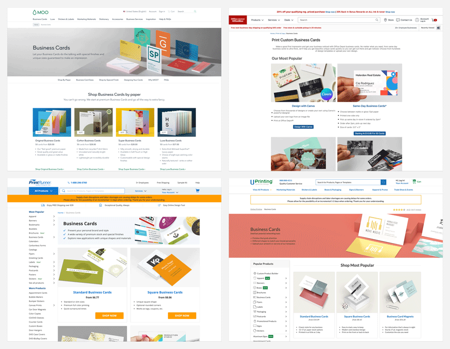
VistaPrint,Moo,Office Depot,and Uprinting all used an intermediate category landing page for complex products,a step FedEx Office was skipping entirely.
The team reviewed how VistaPrint,CustomInk,Staples,Canva Print,and Uprinting handled complex product categories. A clear pattern emerged:leading competitors weren't sending customers directly to a product detail page. They were using an intermediate category landing page first,a page that gave customers a high-level overview before directing them to the right product.
For simple products that step is unnecessary friction. For complex products with multiple material options,it's the difference between a confident customer and an abandoned cart.
The current FedEx Office flow was skipping a step that customers for complex products genuinely needed. The landing page was not just a design preference. It was a conversion decision.
What the research established
Customers couldn't distinguish between material options. Four choices with no explanation of what made each one appropriate meant customers either guessed or left.
Pricing was appearing too late in the journey. Customers who reached the price after investing time in configuration were not willing to start over if it was wrong.
The missing step was structural,not cosmetic. Every leading competitor used an intermediate landing page for complex products. FedEx Office was skipping it entirely.
Both audience types needed the same fix. Full-time employees/volunteers and small business owners differed in pace and stakes,but both needed enough information to make a confident decision before committing.
Define
The research pointed to two problems,not one. Customers were getting lost before they'd even chosen a product,at the navigation level. And they were getting lost again on the product detail page at material selection. Three weeks was short. Testing both together made more sense than solving one and guessing about the other.
The landing page idea wasn't immediately agreed on. The argument against it was reasonable:adding a step to a purchase flow is usually something you avoid. Standard conversion rate logic,and it's not wrong.
The reframe that moved it forward: the landing page wasn't adding friction. It was removing the friction of landing on a page that asked for a decision before giving customers what they needed to make one. Those are different things. The first framing makes it sound like we're making the funnel longer. The second makes clear we're fixing a broken entry point. Once that was the frame,the VOC data and competitive analysis made the case almost by themselves.
Getting alignment on that reframe was as important as the design work that followed. A recommendation that doesn't survive a stakeholder conversation doesn't ship.
Problem framing
Current state
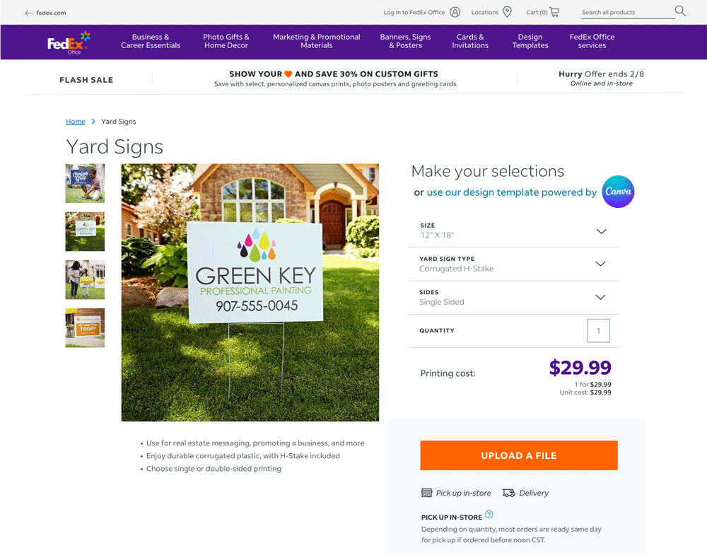
Customers land directly on a product detail page and are asked to choose between 4 material options with no context
Design direction
Give customers the context to make a confident decision before asking them to make one
Two distinct questions to answer
Question 01:Navigation
Does an intermediate category landing page outperform going direct to the product detail page?
Question 02:Product page
For customers who land directly on the PDP,which presentation of material options gives them the most confidence?
What we scoped out
How the team framed the problem before opening Figma,what we were solving,what we left out,and the two specific questions the design work needed to answer.
Develop
Before any design work started the team aligned on objectives. With two junior designers on the project,getting everyone pointed in the same direction before opening a design tool was not optional. On a three-week timeline there is no room to course correct halfway through. Working through the VOC findings and competitive analysis together before anyone started sketching meant the junior designers could make good calls independently,which produced a tighter result than a solo design pass would have.

The shop by type component,side-by-side material comparison,the exact thing customers were missing.
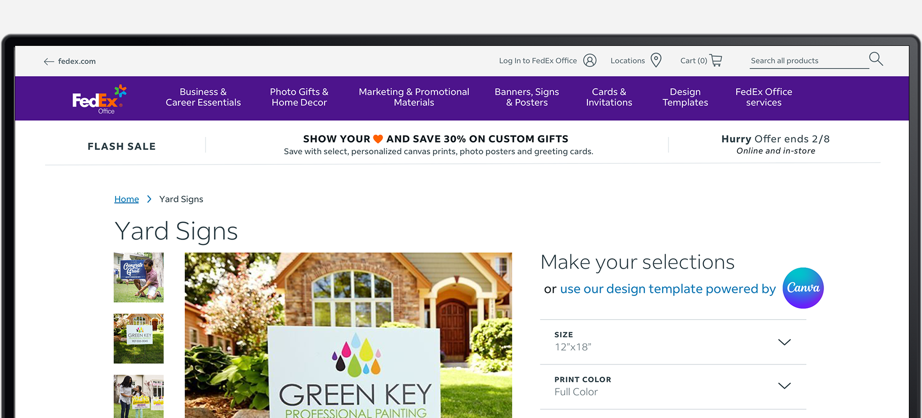
The Category Landing Page
Would an intermediate landing page outperform sending customers straight to the product detail page? That was the primary question.
Four things customers needed but weren't getting:options they could compare without drilling in,pricing visible before they'd gone too far,template inspiration to help them visualize the end result,and answers to the questions the VOC data showed they were already asking.
Each option included plain-language guidance for the question the old page never answered:when would I choose this over the others?

Full Landing Page
All four components together:pricing above the fold,options comparable without drilling in,answers to the questions that were causing drop-off.
Product Detail Page Variants
Not every customer comes through navigation. Some land directly on the product page from search or a shared link. For those customers,two variants:
Visual menu:material options as images rather than text labels,with key information visible at the point of selection.

Tooltip guide:closer to the existing experience,contextual information surfaced on hover or selection.
Both built as high-fidelity prototypes and tested head to head.
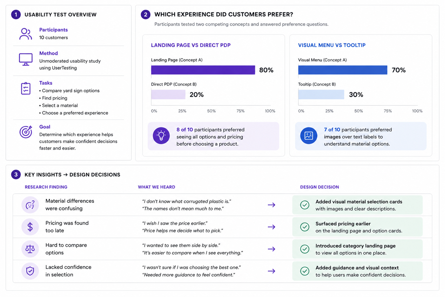
Testing
We ran an unmoderated usability test through UserTesting,10 participants,designed with the UX researcher. Two questions:does the landing page outperform going straight to the PDP,and which material selection approach gives customers more confidence?
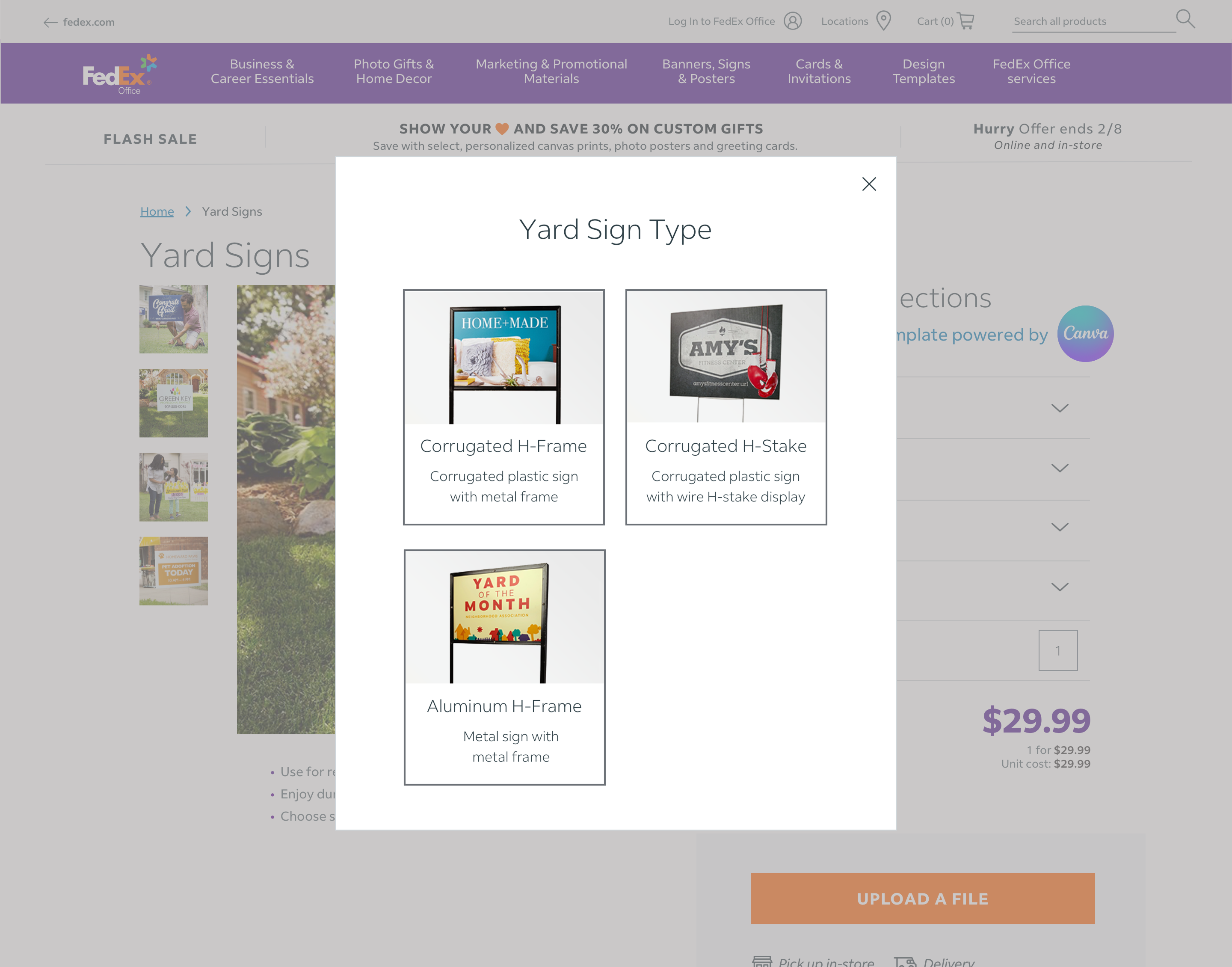
Popup,material type selector surfaced as an overlay on interaction.
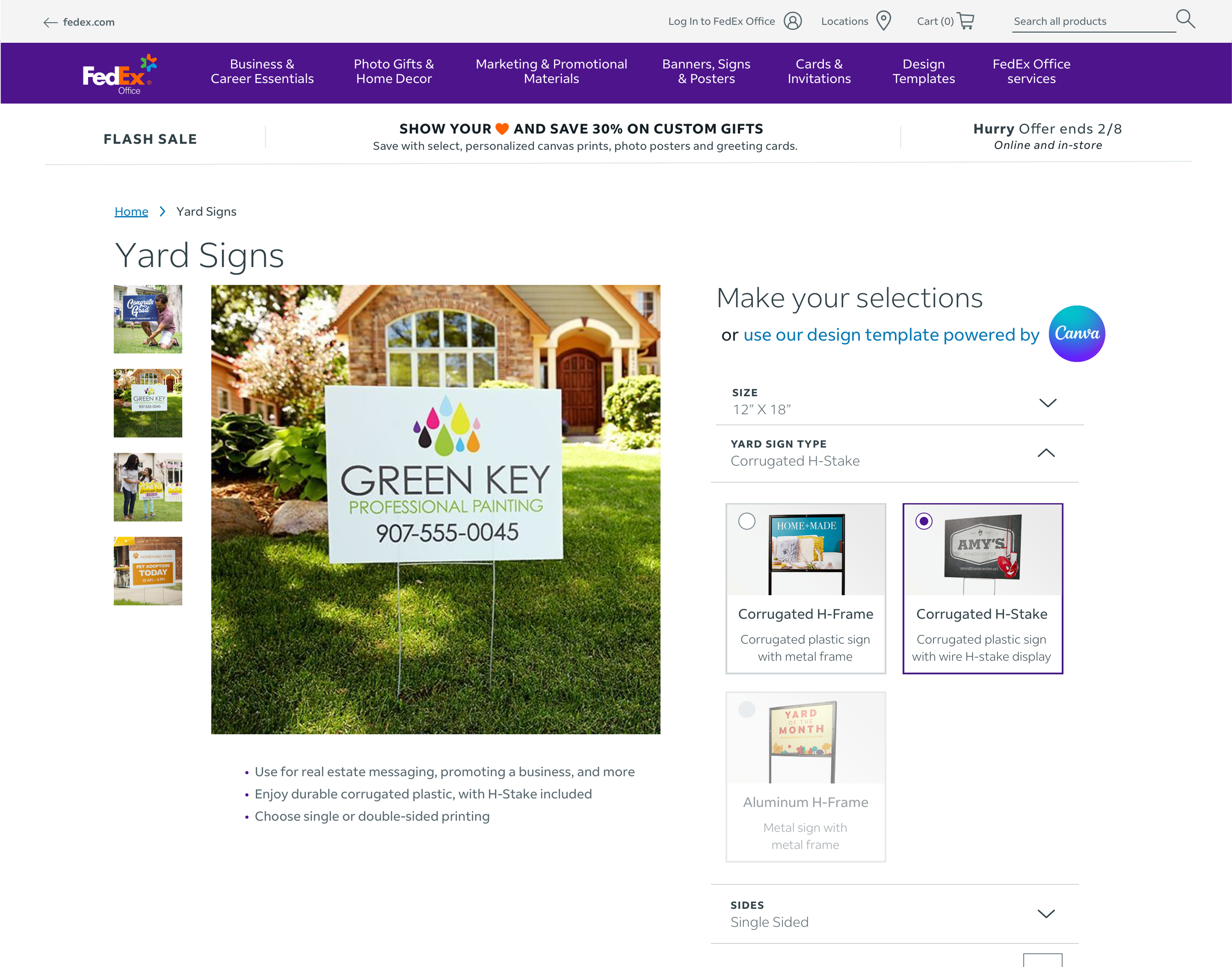
On-page,inline visual selection cards replacing the dropdown.
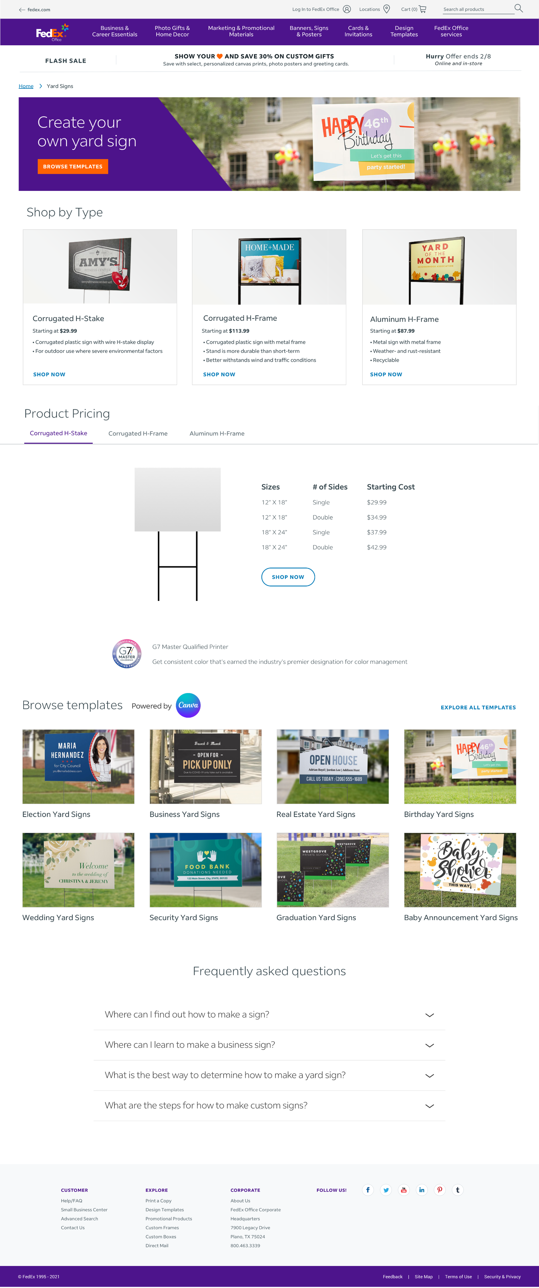
Full-page landing page,category entry point surfacing all options,pricing,and templates before the product detail page.
The landing page result wasn't surprising. The margin was. 8 out of 10 is a strong signal for a usability test,and the reasoning participants gave was consistent:seeing options side by side before committing removed a decision that had been sitting in the wrong place. Nobody wanted to pick a material before understanding what their choices actually were.
The visual menu result was the one that shaped the recommendation most. The tooltip approach wasn't bad. It just required customers to do more work to get the same information. When you're already uncertain,more steps is the wrong direction.
Getting these findings in front of leadership at a company the size of FedEx requires more than a good deck. I presented across product,marketing,and retail,each group weighing different risks. The VOC data named the problem. The test results showed the solution worked. Together they were harder to push back on than a design recommendation on its own. Both concepts were prioritized for development in the weeks following the project.
The final product detail page design incorporating the visual menu approach. The material selection step that had been one of the primary sources of customer confusion now gives customers what they need to choose confidently without leaving the page.
Impact
Both concepts shipped. I set up monitoring through the same VOC surveys that surfaced the problem,to track whether the fix actually worked.
Yard signs were never really the point. The real deliverable was a validated pattern:landing page structure,visual menu,scalable content components,that could apply to every complex product in the marketplace. This project proved the approach worked. The roadmap question after that wasn't whether to do it,but how fast.
What We Took Away
Three weeks forces discipline. The VOC data kept us honest. Every design decision traced back to something customers had actually said or done. That connection made the work easier to defend and easier to act on quickly.
The debate about the landing page was more useful than it felt in the moment. Being pushed to articulate why a landing page was the right solution rather than a better product detail page forced a clearer argument. The reframe,that the landing page was removing friction rather than adding a step,came out of having to defend the direction rather than just assert it. That sharper framing is part of what got it on the roadmap.
The leadership conversation about testing was worth having. The instinct to skip testing on a short timeline is understandable. Three weeks feels too short. But the test took a week,the results were clear,and the recommendation had evidence behind it rather than just confidence. At a company the size of FedEx,that difference matters more than the week it cost.

%20(6).png)
%20(8).png)
%20(5).png)


